Website & Online Presence
Why Every Creator Needs a Personal Website
Social platforms help people discover you. A website gives them somewhere useful to go next.
By Hubpage Editorial Team · November 3, 2026 · 6 min read
You publish useful content, answer questions, and spend time building an audience. Then someone clicks your profile because they want to know more.
Where do they land?
For many creators, the answer is another social profile, an outdated portfolio, or a long list of links that leaves the visitor to figure everything out. The content did its job. The destination didn’t.
That is the practical case for a personal website. It gives interested people one clear place to understand what you do, explore your work, and take a useful next step.
You don’t need a sprawling site or a six-week branding project. A focused page can be enough. But you do need a destination that serves your goals rather than simply displaying your posting history.
Social profiles are discovery channels, not your whole business
Social platforms are useful. They put your work in front of people who might never search for your name. Keep using the channels that work for you.
The problem starts when your entire online presence depends on them.
You don’t control their layout, distribution rules, account policies, or available profile features. A change to any of those can affect how people find you and what they see.
A personal website gives you more control over the destination. You choose the message, the order of information, and the action you want visitors to take.
That control isn’t absolute. Websites still depend on hosting providers, domain registrars, and other services. But a domain you register and maintain can point to a different provider later. That makes it a useful, portable address for your work.
Give every channel the same destination
Imagine a cooking creator who publishes short videos, writes occasional guest articles, and appears on podcasts. Each channel introduces them to a different audience.
Their website connects those appearances. Visitors can find the recipes, understand the creator’s approach, and sign up for future updates without searching across three apps.
The platforms introduce you. Your website supplies the context.
A personal website makes your work easier to understand
A social feed is organized around posts. Your work is probably organized around something else: a specialty, a service, a creative practice, or a problem you help people solve.
Those are not the same structure.
A freelance illustrator’s latest posts might include a sketch, a personal update, and a process video. All worthwhile. But an art director arriving with a project needs answers to different questions:
- What kind of illustration do you specialize in?
- Have you done work relevant to this project?
- Are you available for commissions?
- How should someone contact you?
A website lets you answer those questions in a deliberate order. It also helps people whose first encounter with you wasn’t your best or most representative piece of content.
A useful opening statement follows a simple pattern: what you do, who it’s for, and why it matters.
“I create illustrations” is accurate. “Editorial illustration for publications covering science, technology, and climate” gives the right visitor much more to work with.
It turns attention into a next step
Attention is useful only if people can do something with it. A visitor might want to hire you, read your best tutorial, join your audience, or find a resource you mentioned.
Your website should make that action obvious.
This doesn’t mean covering the page with buttons. It means choosing one primary action based on what you are building right now.
- A new educator: Invite visitors to sign up for future lessons.
- A freelancer: Direct prospective clients to a clear inquiry process.
- A video creator: Organize the resources referenced in recent videos.
- A digital product builder: Explain the problem being explored and invite interested people to a waitlist.
Secondary links can stay. They just shouldn’t compete equally with the main purpose of the page.
If client inquiries are your priority, the examples on Hubpage for professionals are a relevant starting point. Think about what a qualified prospect needs to know before getting in touch, not just where to place a contact button.
Audience signup creates another way to stay connected
A follower relationship exists within a platform. An email signup, collected with clear permission, gives you another way to maintain contact.
That doesn’t guarantee anyone will read your messages. It does mean you aren’t relying exclusively on a feed to reconnect with people who asked to hear from you.
Make the signup promise specific. “Join my newsletter” gives visitors little reason to care. “Get a practical photography exercise every other Friday” explains both the value and the expected frequency.
Only promise what you can deliver. If you haven’t started publishing emails, say that visitors are signing up for launch updates rather than implying an established newsletter exists.
Also distinguish collection from delivery. Hubpage supports audience signup, but it does not currently send email campaigns or provide CRM automation. Plan separately for how you will manage consent, send messages, and handle unsubscribe requests using an appropriate email service.
Your website can become a useful reference point
Good work often disappears into a feed long before it stops being useful.
A website gives you a place to keep the important pieces visible: your strongest case study, a beginner’s guide, an interview, or the resource people repeatedly ask you to send.
It also gives collaborators one address to use in event listings, podcast notes, author biographies, and recommendations. You can update the destination without asking everyone to replace an old project link.
A public, indexable website can also help people find information about you through search. That is a possibility, not a promise of traffic. Start by making your name, specialty, and work clear rather than treating a new site as an automatic audience generator.
What a personal website for creators actually needs
Your first version should answer basic visitor questions, not demonstrate every feature your website builder offers.
Start with five essentials
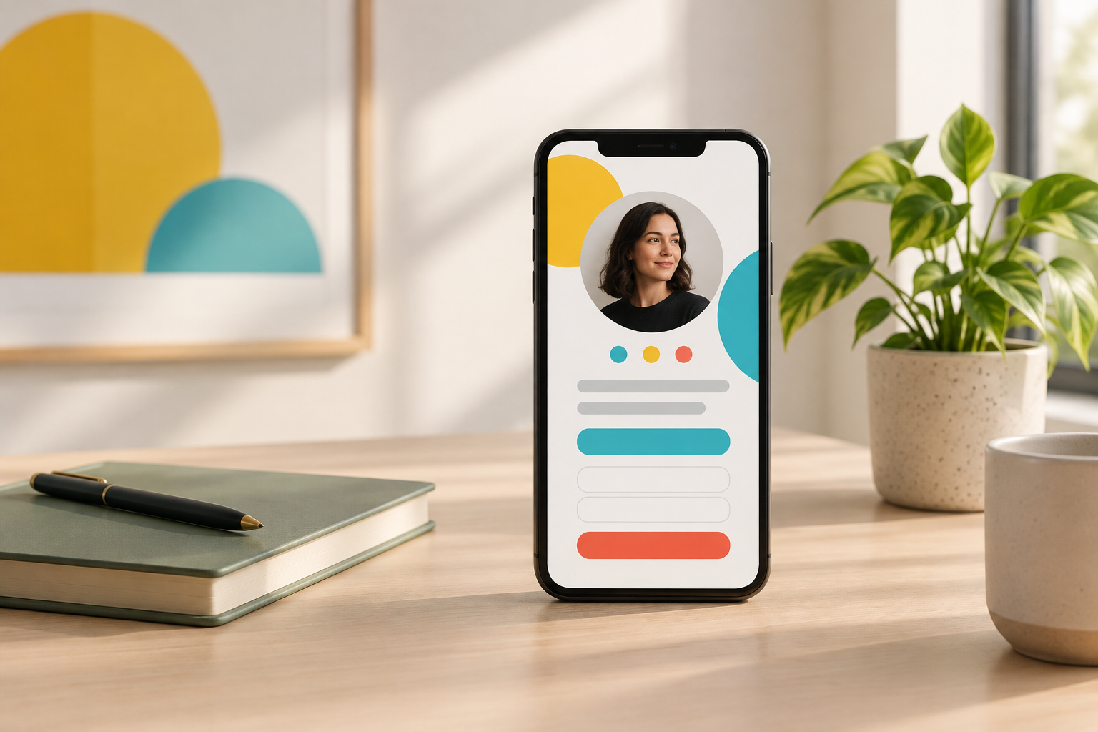
- A clear introduction. Use your name, a recognizable photo or visual identity, and a specific description of your work.
- A primary action. Choose the most useful next step and give it a descriptive label.
- Selected work. Show a few relevant examples rather than everything you have ever published.
- A short explanation. Add enough background to help someone understand your experience and approach.
- A contact or signup route. Let interested visitors continue the relationship.
Use accurate project descriptions and testimonials only when you have permission. If you’re starting out, thoughtful sample projects are better than inflated claims.
Make it work on a phone
Someone arriving from a social app may be viewing your page on a small screen. Check that the introduction is readable, buttons are easy to tap, and important information doesn’t disappear beneath oversized graphics.
Use labels that explain the destination. “View my illustration portfolio” is more helpful than “Explore.” For layout ideas, review these link-in-bio examples with your visitor’s task in mind.
Start small, then expand when there is a reason
A one-page site can be a real personal website. The distinction that matters is whether it helps visitors, not how many pages it contains.
A focused hub may be enough when you mainly need an introduction, selected links, and audience signup. Hubpage supports those elements alongside interactive quizzes and polls. If you need that starting point, you can create your free Hubpage without first planning a larger site.
Add complexity when your work requires it. A growing library of articles may need a publishing system. Detailed case studies may deserve separate pages. Selling products requires an appropriate commerce service; product selling is not currently available in Hubpage.
Before publishing, ask someone unfamiliar with your work to review the page. Can they explain what you do, who it’s for, and what they should click next?
That is a better launch test than whether the design feels finished. Your website’s first job is to make the next step clear. Everything else can improve as your work develops.